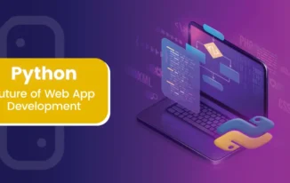
As we move ahead in 2022, there has been a tremendous change in the trend related to website design selection. People have been more inclined towards simple and professional appearance. New design trends for 2023 have been realeased and web designers need to be constantly looking for new trends.
No longer flashy images and flash videos or graphics, allure the market rather on the other hand people prefer magazine like designs or more of white space.
The reason being is that now days the websites are not only the source of information but now they need is to engage people better such as by blogs, or Q&A etc. Their comments, likes, shares and subscription matters a lot.
For that CMS are playing a very important role. As more and more people tend to take their business online thus increasing the overall internet traffic. There is a much need to make your website look more sophisticated with a touch of class.
As, WordPress always make your freak flag fly high by adding bells and whistles to your website, here I am listing 14 hot and trendy web design currently trending in the market.
If you have not beefed up, then better take help from web design services offered by plethora of companies across the internet and real world.
1. Minimalism
Minimalism is the top gainer in the website design arena and has been influencing other al lot. The websites includes simplified logos and typefaces and focus more on the actual content rather than creating a mess around the pages.
There are no Footers, borders and sidebars. Above all, even the color palettes are being used to the minimum in the maximum simplified way.
Most of the companies do not prefer flashy and over dominating colors rather they just want only one single dominant color in their entire website design. For example, StubHub’s logo design change is an excellent example of minimalism design.
2. App-Like Menus
With the advent of mobile market and increasing traffic from mobile devices, has let the designers and illustrators re-design the look of the web pages. There is no longer space for obsolete sticky menus and sidebars.
The designers are avoiding that to create more room for content which is actually desired by the readers. Now a days the design is complete app related like rather than going for static menus, they are generally hidden and noted by a single icon which is a stack of three lines.
This icon when selected or clicked, drop downs or sometimes slides into a robust menu. For Example, Unmetric is a perfect example of this design.
3. Ghost Buttons
Again, the loud and flashy buttons or menu icons are becoming outdated and the thing which is ruling the market is the new transparent style buttons. They are known as ghost buttons and help in highlighting more of the content.
As these are less obtrusive they will not force the readers to click and navigate away from the page. A web design firm, BigDrop portrays has a prominent ghost button on the home page.
4. The reign of the hero image
We have already seen that in past couple of years, there used by a hero image with HD picture mainly comprising of the header of the websites. It used to be stretched over the entire browser window with just few text words overlaying it.
With the dawn of 2017, the picture has been replaced by HD video. Some of the website owners removed the hero image altogether and preferred a simple and clean logo instead. Spotify is an excellent example for this style.
5. Interesting typography
The typography has also gained new levels. With the websites becoming more and more simple, web designers are focusing on creating a subtle and impactful custom typography so as to feature a powerful statement with seamless distractions to entirely focus on its message to the users.
6. Stock Photos that don’t look like stock photos
The stock photos are gone and there is an era of jaw-dropping HD visuals. With the coming of communities such as 500px and Unsplash, going for high quality do-whatever-you-want-with-it photography has become easier than before.
So, the websites don’t appear like having uncoordinated stock photos but they genuinely feel amazing.
7. Single Page Design
Now days, people don’t want to visit multiple pages, rather scrolling a single page is much better. The reason being no one has time to wait for a page to load.
In fact many of the websites have focused on single page design and keeping all their things on the same page.
Thus making them more mobile friendly as well as scrolling with thumb is much easier than clicking on any link and then waiting for the page to load.
8. Parallax Scrolling
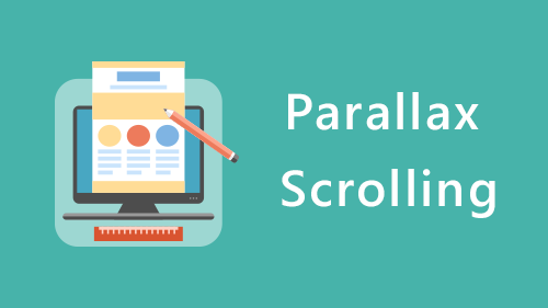
This is one of the most trending as well as most loved designs. Parallax scrolling gives a 3-D illusion which instantly draws the attention of the audience and the visitors and has the maximum conversion rate of visitors to users.
For example, Dangers of Fracking uses this design so incredibly making the user feel the immersive effect of parallax scrolling.
9. Modular Design
This design helps to impart a well organized and aesthetically pleasing impact on the user. Often referred by various names such as grid, cards or tiles make the content more manageable and user-friendly.
Generally single column content display is inefficient and outdated now. This makes the content more visually engaging as well as more intuitive. The Next Web is a perfect example of this design.
10. The evolution of flat design
The popularity of this design can be well judged from the fact that Google followed this and released his own design pattern known as material design.
This design deploys the same appealing flat design whose main aim is clean and simple presentation, giving more way to white space.
11. Line Icons
Just like the material design, Line Icon design has revolutionized the thinking process of all web design services providers. Here the icons are not like the objects but are basically made with simple lines and shape which symbolize that action.
12. Google Maps Integration
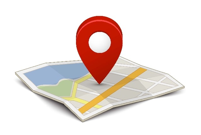
With incredible customization options available with Google maps, its getting better and better with each passing day.
With that, companies are integrating maps to their sites and customize the maps’ colors so as to complement with their style. Airbnb is the perfect example for this design.
13. Scalable Vector graphics (SVG)
SVG enables the graphics to be represented as vectors so that they can be scaled to any device and any resolution. Gone are the days when the graphics looked pixilated.
Now is the era of high definition retina display. Their sharpness and clarity is maintained on all devices. A JavaScript SGG Library, Snap.svg, is among the finest examples of this design.
14. Vertical Split Layouts
Split screen layouts have been trending these days. It serves dual purposes one, the designers can present the content twice to users with a simple and clean approach and the second one, it’s an amazing way to imbibe equality among two things as the standard web layouts gives preference to the important one.
Peugeot , the car maker has a vertical split layout on the landing page of its website.
Now, it’s the time to make your choice. Which design will you go for?